【Flutter 3.3】初學ListView - 可愛的角落生物我來了
最近實際學了一下Flutter ~ 抖動?之後,個人發現它的想法不太像一般手機APP的想法,反而比較像網頁?,都是以Widget去組合,把元件切的很細,一直去做組合,而且反而懂元件的種類,遠比寫程式硬寫來得重要… 今天,續上集的熱烈回應之後,我們就來做一個角落生物的列表,那以下的圖片Link呢,都僅做為教學之用,Let’s Go…
作業環境
| 項目 | 版本 |
|---|---|
| macOS | Big Sur 12.5.1 arm64 |
| OpenJDK | 18.0.1-Zulu arm64 |
| Dart SDK | 2.18.0 arm64 |
| Flutter SDK | 3.3.0 arm64 |
| Xcode | 13.4.1 arm64 |
| Android Studio | 2021.2.1 arm64 |
| Visual Studio Code | 1.70 arm64 |
| Ruby | 2.6.8 arm64 |
| CocoaPods | 1.11 x86_64 + Ruby-FFI (Foreign Function Interface) |
首先,要做一支長的像這樣的APP
自訂ListView的長相
自訂Item的長相
import 'package:flutter/material.dart';
class ProfilePage extends StatefulWidget {
const ProfilePage({Key? key, required this.title}) : super(key: key);
final String title;
@override
State<ProfilePage> createState() => _ProfilePageState();
}
class _ProfilePageState extends State<ProfilePage> {
final _item = SizedBox(
height: 128.0,
child: Stack(
fit: StackFit.expand,
children: [
Image.network(
'https://pinkoi-wp-blog.s3.ap-southeast-1.amazonaws.com/wp-content/uploads/sites/6/2021/12/13155150/角落生物-1-1021x1024.webp',
fit: BoxFit.fitWidth,
),
Column(
crossAxisAlignment: CrossAxisAlignment.stretch,
children: [
Container(
decoration: const BoxDecoration(
color: Color.fromARGB(64, 0, 0, 0),
),
child: const Padding(
padding: EdgeInsets.all(8.0),
child: Center(
child: Text(
'Title',
style: TextStyle(
fontSize: 24,
fontWeight: FontWeight.w900,
color: Colors.black87,
),
)),
),
),
Expanded(
child: Container(
decoration: const BoxDecoration(
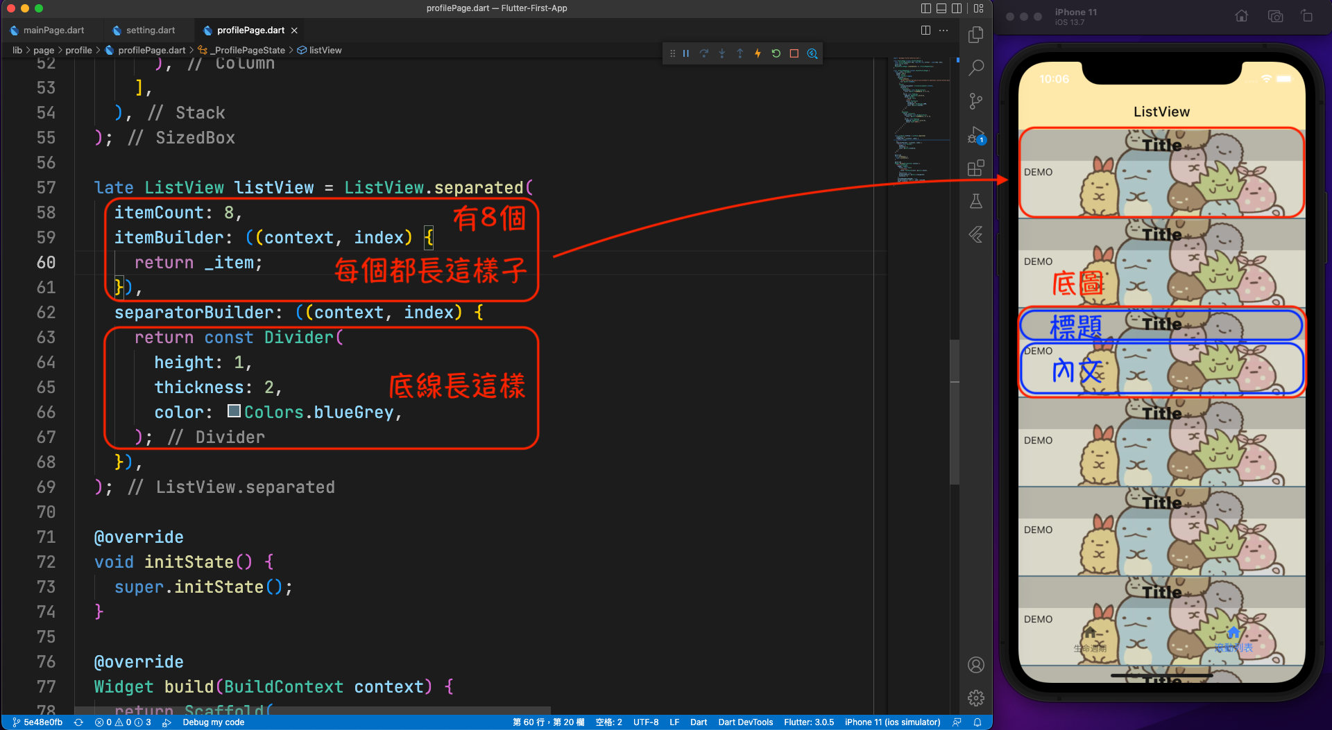
color: Color.fromARGB(32, 0, 0, 0),
),
child: const Padding(
padding: EdgeInsets.all(8.0),
child: Text('DEMO'),
),
),
),
],
),
],
),
);
late ListView listView = ListView.separated(
itemCount: 8,
itemBuilder: ((context, index) {
return _item;
}),
separatorBuilder: ((context, index) {
return const Divider(
height: 1,
thickness: 2,
color: Colors.blueGrey,
);
}),
);
@override
void initState() { super.initState(); }
@override
Widget build(BuildContext context) {
return Scaffold(
appBar: AppBar(
title: const Text(
'ListView',
style: TextStyle(color: Colors.black),
),
centerTitle: true,
backgroundColor: Colors.transparent,
elevation: 0,
),
extendBodyBehindAppBar: true,
backgroundColor: Colors.amber.shade100,
body: listView,
);
}
}
SizedBox - 盒子
- 首先,先做一個高度為128的item,利用SizedBox來做到這件事情,然後背景放張滿版的圖…
- 其中,BoxFit.fitWidth,就有點像iOS中,UIImageView的contentMode的設定,可以設定圖片填充的樣式,大家可以自己改改看,比較有什麼不同…
- 然後利用Image.network()去讀取網路上的圖片…
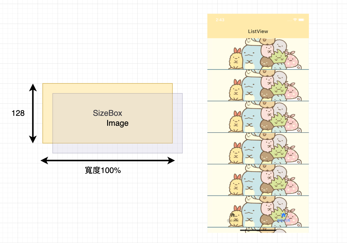
class _ProfilePageState extends State<ProfilePage> {

  final _item = SizedBox(
    height: 128.0,
    child: Image.network(
      'https://pinkoi-wp-blog.s3.ap-southeast-1.amazonaws.com/wp-content/uploads/sites/6/2021/12/13155150/角落生物-1-1021x1024.webp',
      fit: BoxFit.fitWidth,
    ),
  );
}
Stack - 疊疊樂
- 再來就要組合內容的部分,如果要一層層的『疊上去』的話,就使用Stack來處理…
- 簡單來說,就有點像趴趴熊的樣子,一個個壓上去…
- 其中要注意的是,Stack中也有個填充的樣式可以設定,就是StackFit.expand這個值,大家也可以去試一下改變它會造成什麼樣的結果…
- 我們就利用最單純的Container,一層層疊上去…
class _ProfilePageState extends State<ProfilePage> {
  final _item = SizedBox(
    height: 128.0,
    child: Stack(
      fit: StackFit.expand,
      children: [
        Image.network(
          'https://pinkoi-wp-blog.s3.ap-southeast-1.amazonaws.com/wp-content/uploads/sites/6/2021/12/13155150/角落生物-1-1021x1024.webp',
          fit: BoxFit.fitWidth,
        ),
        Column(
          crossAxisAlignment: CrossAxisAlignment.stretch,
          children: [
            Container(
              decoration: const BoxDecoration(
                color: Color.fromARGB(64, 0, 0, 0),
              ),
              child: const Center(
                child: Text(
                  'Title',
                  style: TextStyle(
                    fontSize: 24.0,
                    fontWeight: FontWeight.w900,
                    color: Colors.black87,
                    backgroundColor: Colors.red,
                  ),
                ),
              ),
            ),
          ],
        ),
      ],
    ),
  );
}
Column - 千層糕
- 如果要上下一個個放上去的話,就使用Column吧…
- 當然,有上下放,就會有左右放的Row
- 在視覺上,就有點像千層糕的樣子,一層一層的…
- 這其實跟iOS的UIStack View滿像的…
- 如果最後一個要填滿的話呢?就加上Expanded,讓它放到最滿吧…
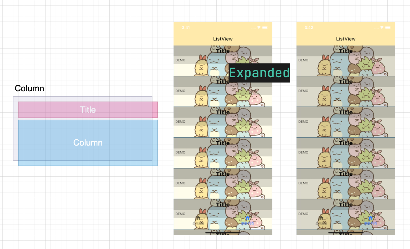
class _ProfilePageState extends State<ProfilePage> {
  final _item = SizedBox(
    height: 128.0,
    child: Stack(
      fit: StackFit.expand,
      children: [
        Image.network(
          'https://pinkoi-wp-blog.s3.ap-southeast-1.amazonaws.com/wp-content/uploads/sites/6/2021/12/13155150/角落生物-1-1021x1024.webp',
          fit: BoxFit.fitWidth,
        ),
        Column(
          crossAxisAlignment: CrossAxisAlignment.stretch,
          children: [
            Container(
              decoration: const BoxDecoration(
                color: Color.fromARGB(64, 0, 0, 0),
              ),
              child: const Padding(
                padding: EdgeInsets.all(8.0),
                child: Center(
                  child: Text(
                    'Title',
                    style: TextStyle(
                      fontSize: 24.0,
                      fontWeight: FontWeight.w900,
                      color: Colors.black87,
                    ),
                  ),
                ),
              ),
            ),
            Expanded(
              child: Container(
                decoration: const BoxDecoration(
                  color: Color.fromARGB(32, 0, 0, 0),
                ),
                child: const Padding(
                  padding: EdgeInsets.all(8.0),
                  child: Text('DEMO'),
                ),
              ),
            ),
          ],
        ),
      ],
    ),
  );
}
讀取JSON資料
準備Sample.json
- 首先呢,先準備一下假資料…
{
    "result": [
      {
        "title": "角落小夥伴十週年",
        "content": "不經不覺,角落小夥伴已經快要誕生 10 週年了!角落小夥伴 Sumikko Gurashi(又名角落生物)是日本公司 San-X 於 2012 \n創立的卡通角色,描繪了一群喜歡躲藏在角落的小夥伴,每個角色都擁有自己的故事,軟萌樣子讓人憐愛。今天編輯就來帶大家逐一認識這群可愛的角落生物角色,拆解他們虜獲人心的秘密!",
        "imageUrl": "https://pinkoi-wp-blog.s3.ap-southeast-1.amazonaws.com/wp-content/uploads/sites/6/2021/12/13155150/角落生物-1-1021x1024.webp"
      },
      {
        "title": "角落生物是什麼?",
        "content": "早於 2012 年,設計師横溝友里為\n San-X 創立了喜歡躲藏在角落的小生物角色,並推出了首批商品,從此角落生物 Sumikko Gurashi 就誕生了!Sumikko \nGurashi(すみっコぐらし)有「生活在角落」的意思,中文翻譯成「角落生物」或「角落小夥伴」,是一群擬人化的動物及物品(像白熊、炸豬扒、雜草等等)。",
        "imageUrl": "https://i.pinimg.com/originals/93/a8/3b/93a83b7f915defcdcdff15f44d7250f9.jpg"
      },
      {
        "title": "角落生物爆紅原因?",
        "content": "2015 年之時,角落生物僅誕生四年已穩佔 San-X 整體營收的三成(若 50 億日元),2019 年更突破 200 億日元營收,獲得「日本虛擬角色大賞2019」最具人氣獎。小學生、中學生、成年人都在為角落生物瘋狂,到底角落生物為何如此成功?",
        "imageUrl": "https://cdn.hk01.com/di/media/images/dw/20201119/406075579901677568790862.jpeg/ZJhlgTJH9Z012VjiiPqKQtjiI5wfx9MZ7id3_e4nd_0"
      },
      {
        "title": "角落角落生物角色介紹",
        "content": "以下就來看看角落生物重點角色介紹吧!(資料來源:San-X、《角落小夥伴大圖鑑》、《角落生物的生活-這裏讓人好安心》、《角落小夥伴的生活-一直這樣就好》)",
        "imageUrl": "https://fupo.tw/webp/wp-content/uploads/2018/12/d4d5736a855e1c3c71716a901b60f3a2.jpg.webp"
      },
      {
        "title": "角落生物角色 #12 麻雀",
        "content": "麻雀是一隻普通的麻雀,對炸豬扒很感興趣,經常會偷偷啄走他頭上的麵衣。經常四處遊走,時飛時走。與貓頭鷹感情融洽,同時對裹布裏的東西很好奇。",
        "imageUrl": "https://img.4gamers.com.tw/news-image/4e0a86b6-ab5d-48ba-ab57-00d773b98cae.jpg"
      }
    ]
  }
資料的class
- 建立一個存資料的class
- 其中呢,factory關鍵字,就像是工廠方法,快速建立class用的,是一個static的方法…
- 利用這個Sample.fromJSON()就可以建立一個class…
- 然後再利用fromList()這個方法,來解JSON的Map,簡單來說…就是懶…
class Sample {
  String title;
  String content;
  String imageUrl;

  Sample({required this.title, required this.content, required this.imageUrl});

  factory Sample.fromJSON(Map<String, dynamic> json) {
    final record = Sample(
      title: json['title'],
      content: json['content'],
      imageUrl: json['imageUrl'],
    );

    return record;
  }

  static List<Sample> fromList(List<dynamic> jsonList) {
    List<Sample> list = [];

    for (var json in jsonList) {
      final sample = Sample.fromJSON(json);
      list.add(sample);
    }

    return list;
  }
}
讀取JSON文件
- 接著,再利用rootBundle.loadString()去讀取文件檔…
- 然後使用JsonDecoder()去解JSON,變成MAP…
- 最後,去更新ListView的相關資料,其實ListView很像iOS的UITableView…
- 細節的Code就不列出來了,可以自行下載git看看…
class _ProfilePageState extends State<ProfilePage> {

  ListView listViewMaker(int itemCount) {
    ListView listView = ListView.separated(
      itemCount: itemCount,
      itemBuilder: ((context, index) {
        return itemMaker(index);
      }),
      separatorBuilder: ((context, index) {
        return const Divider(
          height: 1,
          thickness: 2,
          color: Colors.blueGrey,
        );
      }),
    );

    return listView;
  }

  void downloadJSON(String assetsPath) {
    Utility.shared.readJSON(assetsPath: assetsPath).then((value) {
      final list = value['result'] as List<dynamic>;
      final sampleList = Sample.fromList(list);

      setState(() {
        _sampleList = sampleList;
      });
    });
  }
}
模擬網路下載資料
- 一般來說,這種列表的資料一定是很多的,少說也有上百筆吧?所以不可能一次性的下載…
- 這邊我們來模擬一下,上拉、下拉後,下載JSON資料,然後更新列表的功能…
- 主要的Code都在這裡了,後面會分成一步步解說…
import 'package:flutter/material.dart';
import 'package:flutter_first_app/utility/widget/progressIndicator.dart';

import '/utility/model.dart';
import '/utility/utility.dart';

class ProfilePage extends StatefulWidget {
  const ProfilePage({Key? key, required this.title}) : super(key: key);
  final String title;
  @override
  State<ProfilePage> createState() => _ProfilePageState();
}

class _ProfilePageState extends State<ProfilePage> {
  final String _title = "萬能的滾動列表";
  final String _assetsPath = "./lib/assets/sample.json";
  final ScrollController _scrollController = ScrollController();

  bool isDownloading = false;
  List<Sample> _sampleList = [];

  @override
  void initState() {
    super.initState();

    downloadJSON(
      _assetsPath,
      action: (list) {
        setState(() {
          _sampleList.addAll(list);
        });
      },
    );

    _scrollController.addListener(() {
      final offset = _scrollController.offset;

      if (isDownloading) {
        return;
      }

      if (offset <= 0) {
        simulationReloadJSON();
      }

      if (offset >= _scrollController.position.maxScrollExtent) {
        simulationDownloadJSON();
      }
    });
  }

  @override
  void dispose() {
    super.dispose();
    _scrollController.dispose();
  }

  @override
  Widget build(BuildContext context) {
    final bottomPadding = MediaQuery.of(context).padding.bottom;

    return Scaffold(
      appBar: AppBar(
        title: Text(
          _title,
          style: const TextStyle(
            color: Colors.black,
          ),
        ),
        centerTitle: true,
        backgroundColor: Colors.transparent,
        elevation: 0,
      ),
      extendBodyBehindAppBar: true,
      backgroundColor: Colors.amber.shade100,
      body: listViewBuilder(_sampleList.length),
      floatingActionButton: Padding(
        padding: EdgeInsets.only(bottom: bottomPadding),
        child: FloatingActionButton(
          onPressed: scrollToTop,
          tooltip: '回到第一個',
          child: const Icon(Icons.arrow_upward),
        ),
      ),
    );
  }

  ListView listViewBuilder(int itemCount) {
    Widget _itemMaker(int index) {
      final sample = _sampleList.elementAt(index);

      final widget = SizedBox(
        height: 200.0,
        child: Stack(
          fit: StackFit.expand,
          children: [
            Image.network(
              sample.imageUrl,
              fit: BoxFit.fitWidth,
            ),
            Column(
              crossAxisAlignment: CrossAxisAlignment.stretch,
              children: [
                Container(
                  decoration: const BoxDecoration(
                    color: Color.fromARGB(96, 0, 0, 0),
                  ),
                  child: Padding(
                    padding: const EdgeInsets.all(8.0),
                    child: Center(
                        child: Text(
                      '(${index + 1}) ${sample.title}',
                      style: const TextStyle(
                        fontSize: 24,
                        fontWeight: FontWeight.w900,
                        color: Colors.black87,
                      ),
                    )),
                  ),
                ),
                Expanded(
                  child: Container(
                    decoration: const BoxDecoration(
                      color: Color.fromARGB(64, 0, 0, 0),
                    ),
                    child: Padding(
                      padding: const EdgeInsets.all(8.0),
                      child: Text(sample.content),
                    ),
                  ),
                ),
              ],
            ),
          ],
        ),
      );

      return widget;
    }

    Divider _dividerMaker(int index) {
      return const Divider(
        height: 1,
        thickness: 2,
        color: Colors.blueGrey,
      );
    }

    ListView _listViewMaker(int itemCount) {
      ListView listView = ListView.separated(
        itemCount: itemCount,
        itemBuilder: ((context, index) {
          return _itemMaker(index);
        }),
        controller: _scrollController,
        separatorBuilder: ((context, index) {
          return _dividerMaker(index);
        }),
      );

      return listView;
    }

    return _listViewMaker(itemCount);
  }

  void scrollToTop() {
    _scrollController.animateTo(
      0.1,
      duration: const Duration(milliseconds: 500),
      curve: Curves.fastOutSlowIn,
    );
  }

  void simulationReloadJSON() {
    WWProgressIndicator.shared.display(context);

    isDownloading = true;

    downloadJSON(
      _assetsPath,
      action: (list) {
        Future.delayed(const Duration(seconds: 3)).then((value) => {
              WWProgressIndicator.shared.dismiss(context),
              isDownloading = false,
              setState(() {
                _sampleList = list;
              }),
            });
      },
    );
  }

  void simulationDownloadJSON() {
    WWProgressIndicator.shared.display(context);

    isDownloading = true;

    downloadJSON(
      _assetsPath,
      action: (list) {
        Future.delayed(const Duration(seconds: 3)).then((value) => {
              WWProgressIndicator.shared.dismiss(context),
              isDownloading = false,
              setState(() {
                _sampleList.addAll(list);
              }),
            });
      },
    );
  }

  void downloadJSON(String assetsPath,
      {required Function(List<Sample>) action}) {
    Utility.shared.readJSON(assetsPath: assetsPath).then((value) {
      final list = value['result'] as List<dynamic>;
      final sampleList = Sample.fromList(list);

      action(sampleList);
    });
  }
}
滾動到底部後更新
- 主要是靠ScrollController來處理滑動的位置訊息,進而判斷是不是到底部了…
- 將ScrollController加上addListener()之後,可以試著log一下offset…
- 主要的重點就是:
- offset <= 0:就是到最上方了
- offset >= _scrollController.position.maxScrollExtent:就是到最下方了
- 這裡要比較注意的是,iOS跟Android預設在處理滾動回饋的方式是不同的,iOS的offset是可以小於0的,所以要加上isDownloading做為開關,不然會一直更新…
- 這一點就很Android / Web了,不像iOS的delegate…
- 最後記得,在結束後,ScrollController要dispose()掉…
class _ProfilePageState extends State<ProfilePage> {

  final ScrollController _scrollController = ScrollController();
  List<Sample> _sampleList = [];

  @override
  void initState() {
    super.initState();

    _scrollController.addListener(() {
      final offset = _scrollController.offset;

      if (isDownloading) {
        return;
      }

      if (offset <= 0) {
        simulationReloadJSON();
      }

      if (offset >= _scrollController.position.maxScrollExtent) {
        simulationDownloadJSON();
      }
    });
  }

  @override
  void dispose() {
    _scrollController.dispose();
    super.dispose();
  }
}
自動回到第一個
- 其實,這個也滿單純的,就設定ScrollController的offset就可以了…
- 這裡因為呢,滾到0的時候會觸發更新JSON,所以『暫時』設定offset = 0.1…
- 不過如果有像iOS一樣,是直接設定IndexPath的話,相信會更方便的…
class _ProfilePageState extends State<ProfilePage> {

 Widget bodyMaker(BuildContext context) {
    final bottomPadding = MediaQuery.of(context).padding.bottom;

    final bodyWidget = Scaffold(
      appBar: PreferredSize(
        preferredSize: AppBar().preferredSize,
        child: WWAppBar(
          title: widget.title,
          color: Colors.black,
          backgroundColor: Colors.transparent,
        ),
      ),
      extendBodyBehindAppBar: true,
      backgroundColor: Colors.amber.shade100,
      body: listViewBuilder(_sampleList.length),
      floatingActionButton: Padding(
        padding: EdgeInsets.only(bottom: bottomPadding),
        child: FloatingActionButton(
          onPressed: scrollToTop,
          tooltip: '回到第一個',
          child: const Icon(Icons.arrow_upward),
        ),
      ),
    );

    return bodyWidget;
  }

  void scrollToTop() {
    _scrollController.animateTo(
      0.1,
      duration: const Duration(milliseconds: 500),
      curve: Curves.fastOutSlowIn,
    );
  }
}
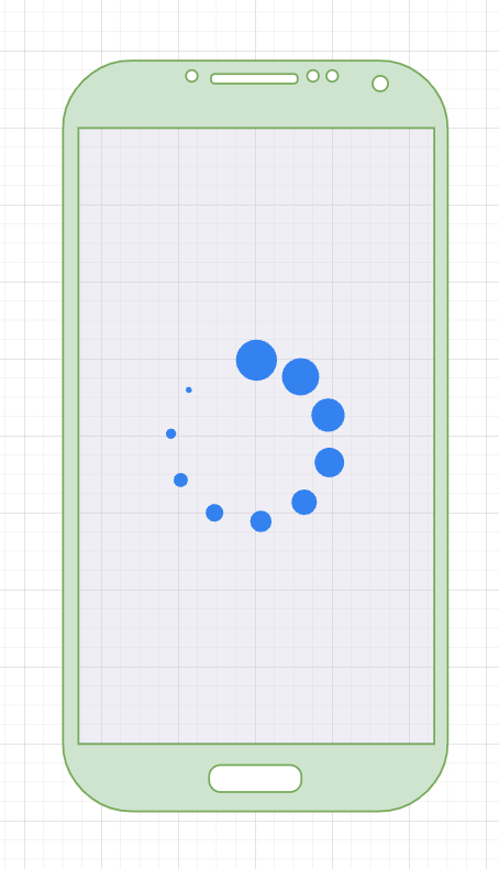
加上loading動畫
- 最後呢,再加上一個轉圈圈,就看起來更有feel了啦…
- 這種提示型的功能,一般統稱做HUD (Head-Up Display),就是抬頭顯示器…
- 這裡是利用CircularProgressIndicator + Navigator.of(context).push(),就是利用開啟下一頁的功能,只要讓Widget背景是透明的,看起來就很像了…
- 這招也是從iOS上學來的,沒想到還真的可以用啊…
import 'package:flutter/material.dart';

class WWProgressIndicator extends StatefulWidget {
  const WWProgressIndicator({Key? key}) : super(key: key);

  static const shared = WWProgressIndicator();

  @override
  State<WWProgressIndicator> createState() => _WWProgressIndicatorState();

  display(BuildContext context) {
    Navigator.of(context).push(
      PageRouteBuilder(
        opaque: false,
        pageBuilder: (BuildContext context, _, __) => this,
      ),
    );
  }

  void dismiss(BuildContext context) {
    if (!Navigator.canPop(context)) {
      return;
    }
    Navigator.of(context).pop();
  }
}

class _WWProgressIndicatorState extends State<WWProgressIndicator> {
  @override
  void initState() {
    super.initState();
  }

  @override
  void dispose() {
    super.dispose();
  }

  @override
  Widget build(BuildContext context) {
    return Scaffold(
      backgroundColor: Colors.black.withAlpha(64),
      body: const Center(
        child: SizedBox(
          width: 128,
          height: 128,
          child: CircularProgressIndicator(
            valueColor: AlwaysStoppedAnimation(Colors.blue),
          ),
        ),
      ),
    );
  }
}
點擊換頁
- 在這裡,利用Navigator來切換至下一頁…
- 也利用ProfileDetailPage的Constructor - 建構子,把選中的值帶過去…
class _ProfilePageState extends State<ProfilePage> {

  void itemOnTap(int index) {
    final sample = _sampleList.elementAt(index);
    Navigator.push(context, MaterialPageRoute(builder: (context) => ProfileDetailPage(sample: sample)));
  }
}
開啟網頁
- 這裡我們想要有點了圖片,然後在網頁開啟該Url…
- 因為一般圖片點擊下去是沒有反應的,只要加上InkWell,就可以給任意Widget增加點選事件…
- 如果只是一般點一下的功能,只要用到GestureDetector就可以了…
- 這裡我們刻意加上onDoubleTap的事件,安裝套件url_launcher
- 其實url_launcher,也能利用Scheme,打電話、開第三方APP…
- 我們可以使用指令安裝,或者是在pubspec.yaml上新增都是可以的…
flutter pub add url_launcher
flutter pub get
import 'dart:developer';

import 'package:flutter/material.dart';
import 'package:flutter_first_app/utility/model.dart';
import 'package:flutter_first_app/utility/utility.dart';
import 'package:flutter_first_app/utility/widget/appBar.dart';
import 'package:url_launcher/url_launcher_string.dart';

class ProfileDetailPage extends StatefulWidget {
  final Sample sample;

  const ProfileDetailPage({Key? key, required this.sample}) : super(key: key);

  @override
  State<ProfileDetailPage> createState() => _ProfileDetailPageState();
}

class _ProfileDetailPageState extends State<ProfileDetailPage> {
  late Sample _sample;

  @override
  void initState() {
    super.initState();
    _sample = widget.sample;
  }

  @override
  Widget build(BuildContext context) {
    return Scaffold(
        appBar: PreferredSize(
          preferredSize: AppBar().preferredSize,
          child: WWAppBar(
            title: _sample.title,
            backgroundColor: Colors.greenAccent,
          ),
        ),
        body: Column(
          children: [
            InkWell(
              child: Utility.shared.webImage(
                _sample.imageUrl,
              ),
              onDoubleTap: () {
                gotoUrl(_sample.imageUrl);
              },
            ),
            Expanded(
              child: SingleChildScrollView(
                scrollDirection: Axis.vertical,
                child: Padding(
                  padding: const EdgeInsets.all(8.0),
                  child: Text(
                    _sample.content,
                    style: const TextStyle(
                      fontSize: 32,
                    ),
                  ),
                ),
              ),
            ),
          ],
        ));
  }

  Future<bool> gotoUrl(String url) async {
    String urlString = Uri.encodeFull(url);
    return await launchUrlString(urlString);
  }
}
非同步 / 異步
- 大家可以看到有Future - 未來這個關鍵字…
- 字如其義,就是要等一下才會有反應的東西,也就是非同步 / 異步的功能…
- 所以它會伴隨著async / await這兩個關鍵字,也就是像js的Promise功能…
- 在Swift 5.5中,也增加了async / await這兩個新特性…
搜尋功能
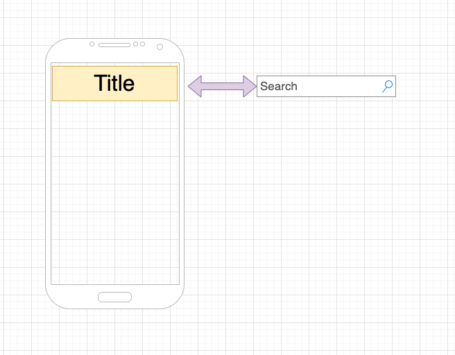
切換TitleBar
- 一般這有兩種顯示的方法:
- 點擊後去開新的一頁,在該頁上顯示搜尋列,像蝦皮APP / Google的APP都是這一類的,好像大多數的商城類APP都是這樣設計的…
- 另外就是,直接在該頁顯示搜尋列,這邊要做的就是這一種…
- 利用切換AppBar(title:)的方式去處理,動態切換上面的Widget…
- 簡單來說,就是點下去,然後更新Title的Widget…
- 這是自己想的方法,所以…不保固…XD
class _WWAppBarState extends State<WWAppBar> {

@override
  Widget build(BuildContext context) {
    final appBar = AppBar(
      title: appBarTitleBar,
      titleSpacing: 0,
      centerTitle: true,
      backgroundColor: widget.backgroundColor,
      elevation: 0,
      actions: [
        IconButton(
          icon: searchIcon,
          color: Colors.blue,
          onPressed: () {
            setState(() {
              toggleTitleBar();
            });
          },
        ),
      ],
    );

    return appBar;
  }

  void toggleTitleBar() {
    if (!isSearchBar) {
      isSearchBar = true;
      searchIcon = const Icon(Icons.cancel);
      appBarTitleBar = searchBar();
      return;
    }

    isSearchBar = false;
    searchIcon = const Icon(Icons.search);
    appBarTitleBar = titleBar();
  }
}
實做搜尋功能
- 主要是在SearchBar上,留了兩個Callback Function變數,讓利用它的元件去自訂它的功能…
- 這就像是前面的onTap()一樣的功能…
- 至於實作呢,目前就只是簡單的文字比對而已…
import 'package:flutter/material.dart';

class WWSearchBar extends StatefulWidget {
  final String title;
  final Color? color;
  final Color? backgroundColor;
  final Function(String) searchAction;
  final Function(bool) toggleAction;

  const WWSearchBar({
    Key? key,
    required this.title,
    required this.searchAction,
    required this.toggleAction,
    this.color,
    this.backgroundColor,
  }) : super(key: key);

  @override
  State<WWSearchBar> createState() => _WWSearchBarState();
}
  Widget bodyMaker(BuildContext context) {
    final bottomPadding = MediaQuery.of(context).padding.bottom;

    final bodyWidget = Scaffold(
      appBar: PreferredSize(
        preferredSize: AppBar().preferredSize,
        child: WWSearchBar(
          title: widget.title,
          color: Colors.black,
          backgroundColor: Colors.white,
          searchAction: (value) {
            List<Sample> list = [];

            for (var sample in _sampleList) {
              if (sample.title.contains(value.toLowerCase())) {
                list.add(sample);
              }
            }

            setState(() {
              _sampleList = list.toList();
            });
          },
          toggleAction: (isSearchBar) {
            if (!isSearchBar) {
              setState(() {
                _sampleList = _fullSampleList.toList();
              });
            } else {
              _fullSampleList = _sampleList.toList();
            }
          },
        ),
      ),
      extendBodyBehindAppBar: true,
      backgroundColor: Colors.amber.shade100,
      body: listViewBuilder(_sampleList.length),
      floatingActionButton: Padding(
        padding: EdgeInsets.only(bottom: bottomPadding),
        child: FloatingActionButton(
          onPressed: scrollToTop,
          tooltip: '回到第一個',
          child: const Icon(Icons.arrow_upward),
        ),
      ),
    );

    return bodyWidget;
  }
範例程式碼下載
後記
- 因為本身就是iOS打字工,加上也自學過點一點點點Android,而且本身一開始也是用安卓手機,其實對雙方的UX體驗也有基本的了解,其實要寫的長相一樣,是有點難度啊,因為系統本來就不一樣,不過看起來Flutter在這點上保有各系統的特色,就不知道在市場上能不能接受了?
- 雖然能做得出來,但總是不太正規,畢竟是自學的,請大家多多包含…
- 其實寫教學文章真的很累,除了要能動之外,還要能讓人看得懂,不過個人還是樂於分享的…
- 木葉飛舞之處,火亦生生不息 (木の葉舞う所に火は燃ゆる),請小心用火…XD